
From briefing to brand.
A behind-the-scenes look at how strategy, exploration and collaboration shaped a complete visual identity.
BriefinG
Finding the right direction.
Every project starts with understanding—not just what a client likes, but why. The goal of the briefing is to uncover the patterns behind the references and turn them into clear creative directions.
The founder, Sanyi, reached out with the goal of creating a cohesive visual identity for her podcast Wake Up Latinas. The initial scope included social media templates, episode covers and YouTube thumbnails.
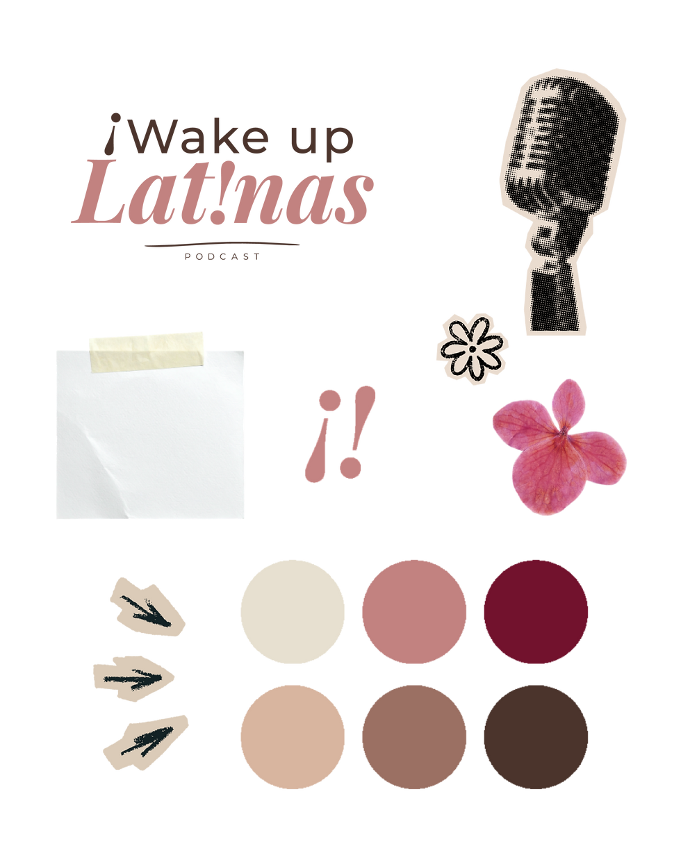
During our first meeting, she shared Instagram accounts she felt drawn to, together with a colour palette she had developed in a branding workshop. While the references varied in style, they all communicated a similar feeling.
Rather than jumping straight into design, I translated those insights into two distinct creative directions. Each concept included realistic mockups of how the podcast would come to life across Instagram, making it easier to compare the overall direction instead of individual design elements.
At this stage, the goal isn’t to create the final brand—it’s to explore different possibilities, gather meaningful feedback and gain clarity before moving into refinement.

Direction 1
Comunidad
Warm. Supportive. Expressive.
Emotional tone:
-
Community
-
Empowerment
-
Belonging
-
Friendship
-
Growth


Direction 2
Conversación
Modern. Reflective. Confident.
Emotional tone:
-
Conversation
-
Reflection
-
Curiosity
-
Confidence
-
Perspective


FEEDBACK
Refining the direction.
The client chose Direction 02. Rather than requesting major changes, the feedback focused on strengthening the identity while preserving the overall concept.

Direction 1
The Connector
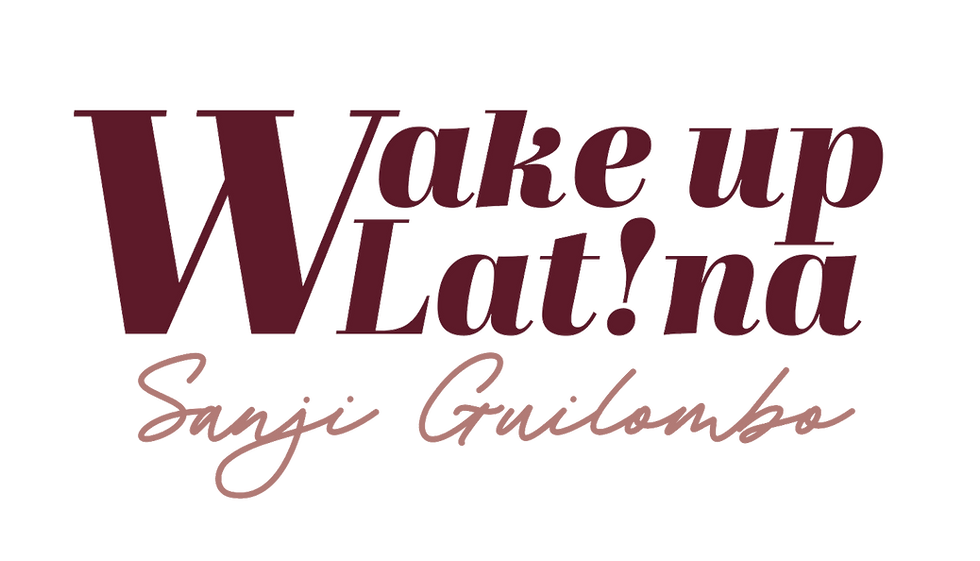
This direction positions Sanyi as the recognisable face of the brand while Wake Up Latina becomes the platform for conversation. A handwritten wordmark adds warmth and authenticity, balanced by a structured typographic system that creates trust and room for the brand to grow.


Direction 2
The Catalyst
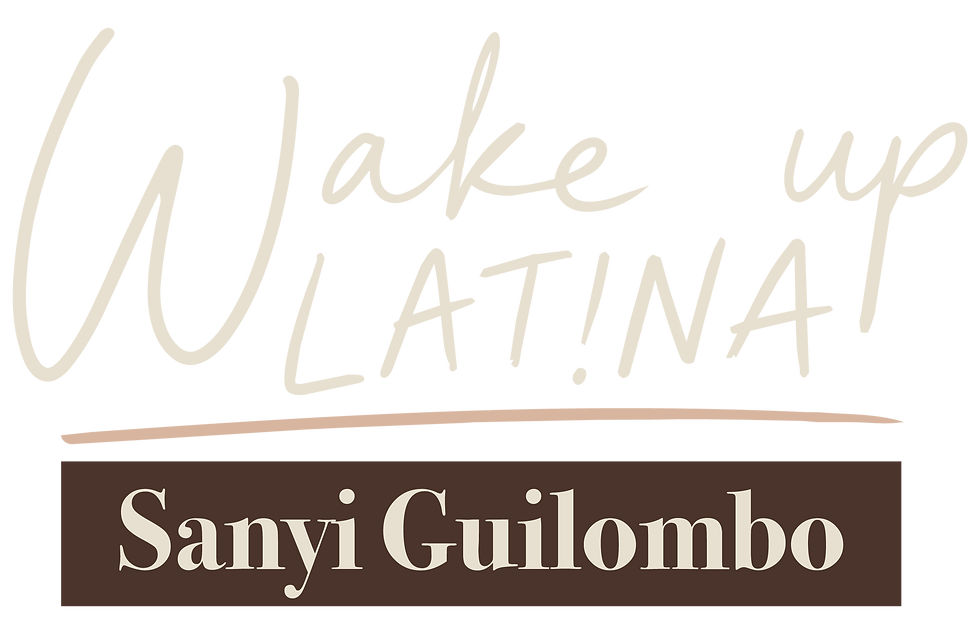
This direction positions Wake Up Latina as the brand, with Sanyi as its voice. Editorial typography creates a confident, premium identity designed to grow beyond the podcast into workshops, events and future ventures.


ready to launch
A complete brand system.
A flexible identity designed to grow with the podcast across every touchpoint.
Corporate identity
A set of logos and versions to use for different background colors was essential. Also I used the original color palette but added two more colors for depth and flexibility.


social system
A flexible set of Instagram post and story templates designed to create a cohesive feed while giving every piece of content Sanyi’s unique voice.


podcast & youtube

Curious to see Print material I designed?
Explore it here →
