Illustration
Illustration that informs, delights and tells stories.
creating emotional anchors
Characters
For BLX’s Christmas campaign, I developed a flexible visual language inspired by Swiss design principles and adapted it to the club’s bold and playful personality. The challenge was to create 24 unique pieces of content that felt exciting individually while remaining cohesive as a series.
I designed a set of festive pictogram-style illustrations and established a clear system based on BLX’s signature circle motif. Each day of the advent calendar was represented through a combination of filled and outlined circles, creating an intuitive way to navigate the campaign while adding anticipation and rhythm throughout the month.
The result was a scalable design system that extended across social media, stories and animations. Bringing structure, recognisability and a touch of holiday magic to every post.
Ventimeras mascot bosse
Turning a ventilation company into a brand people remember.
For Ventimera, I developed Bosse — a friendly dog character designed to bring warmth, personality and recognisability to a highly technical industry.
The goal was to create a mascot that could simplify communication, support storytelling and make the brand feel more approachable without compromising professionalism. Bosse became a flexible visual asset used across social media, campaigns and seasonal communication.
Through recurring appearances and evolving scenarios, Bosse transformed from a single illustration into an integral part of the brand experience.


Rather than designing a static mascot, I focused on creating a character with a clear personality and enough flexibility to adapt to different situations. By establishing consistent proportions, expressions and visual rules, Bosse could evolve over time while remaining instantly recognisable.


As the brand expanded its communication, Bosse accompanied campaigns throughout the year. Seasonal adaptations allowed the company to engage audiences in a playful and authentic way while maintaining a consistent visual identity.


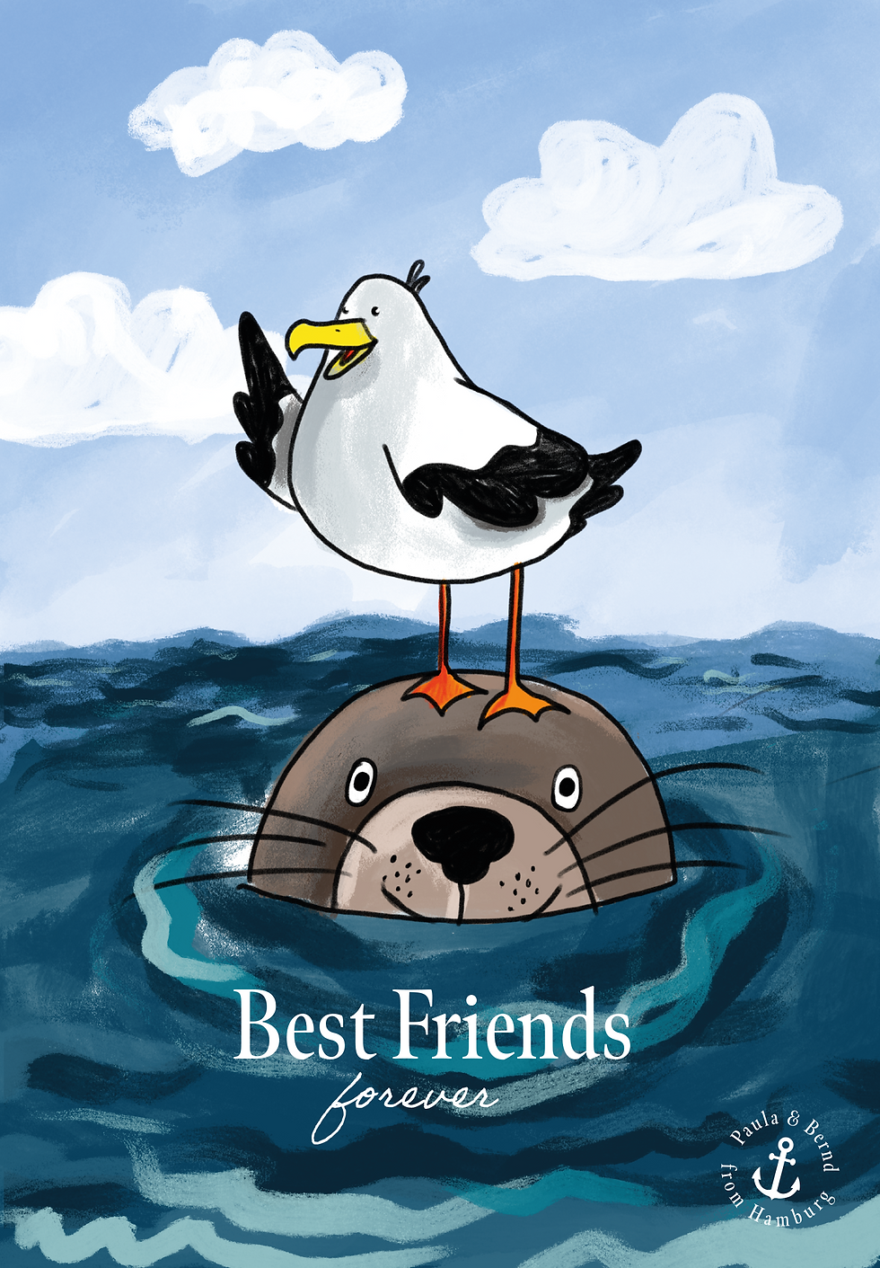
Paula & Bernd
A small universe built around friendship, humour and life by the sea.
Originally created for my former employer Paula & Bernd from Hamburg, this project started as a small collection of illustrated postcards designed to bring warmth, humour and personality into everyday moments.
As the characters evolved, so did the product range. What began with greeting cards expanded into a growing visual universe spanning additional merchandise and seasonal collections. At the heart of the project are recurring characters — a gentle seal, a mischievous seagull and their coastal surroundings — allowing each new piece to feel both fresh and instantly familiar.
From initial concept sketches to finished products, the work combines storytelling, character development and illustration to create emotional connections that extend beyond a single design.


PERSONAL CHARACTERS
Tiny characters carrying big feelings.
These illustrations started as a way to create without expectations. Over time, the whale and the heart developed into a small collection of products, appearing on mugs and gifts designed to accompany quiet moments in everyday life. For me, they represent the joy of creating worlds that are whimsical, a little odd and deeply human.


Making complexity approachable.
Explanatory Illustrations
Illustration can do more than decorate – it can simplify. From technical concepts and workflows to product benefits and abstract systems, I use visuals to make information more accessible, engaging and memorable. By combining clarity with personality, these illustrations help audiences grasp ideas quickly without sacrificing visual appeal.
CONCEPTUAL ILLUSTRATION
Designed to be lived with.
Created as a large-format artwork for kitchens and utility rooms, this illustration helps children and adults understand what belongs in organic waste through playful storytelling and visual exploration. The intention was to design an educational piece that doesn’t feel educational at first glance—a decorative illustration that rewards curiosity and invites repeated discovery.


TECHNICAL ILLUSTRATIONS
Turning technical processes into visual stories.
For Nexus Group, I developed a series of explanatory illustrations to support their visual guidelines and educational material. Working closely with technical experts, I translated complex printing processes into clear diagrams that could be understood by designers, sales teams and customers alike.
The challenge was balancing precision with accessibility: ensuring every step remained technically accurate while presenting the information in a way that felt intuitive and easy to follow.

The diagrams began as hand-drawn sketches used to understand the mechanics of retransfer printing. Through multiple iterations, they evolved into a cohesive illustration system integrated into Nexus Group’s design guidelines.


EXPLANATORY ILLUSTRATION
Making the invisible visible.
For Ventimera, I developed an illustration system that transformed technical concepts around ventilation and indoor climate into approachable visual stories. The house became the central stage for explaining airflow, insulation and energy efficiency across animations, social media and the company’s website.


From illustration to m otion
The same visual language expanded into animation


Curious to see Print material I designed?

Let's create something beautiful together!