Project Overview
Ryggrörelsen is a thriving network care center specializing in spinal and nervous system health. As their practice expanded and a new partner joined, it was time to reimagine their visual identity and online presence.
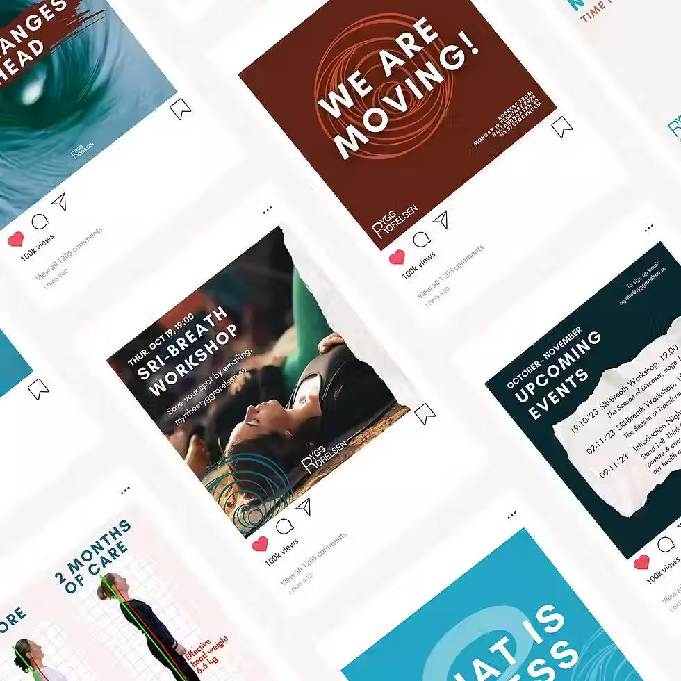
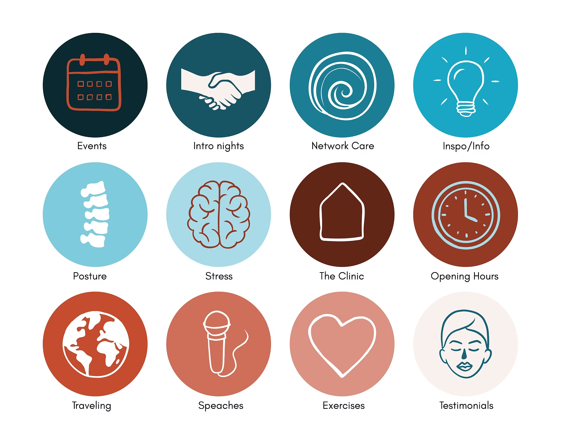
I had the privilege of collaborating closely with their team to develop a complete brand package — from a fresh color palette and corporate guidelines to custom icons and social media templates. This is an ongoing partnership built on shared values, with every design detail crafted to reflect their mission and the genuine care at the heart of their work.
Logo
The logo is a captivating blend of simplicity and symbolism. It's a tall turquoise rectangle that functions as room for a wormhole and the typo Ryggrörelsen. It creates a sense of calm while the wormhole is full of motion and energy, with lines of different thicknesses. In the top left corner, you'll see the name "Ryggrörelsen." The words "Rygg" and "Rörelsen" share the same "R," showing their connection. The font combines the smoothness of curves with straight lines so it is an aesthetic combination fo the rectangle and the wormhole. This logo represents the unique qualities of spinal networks, symbolizing how the mind and body are connected. It conveys a sense of unity, natural movement, and the idea that there's always more to discover. Welcome to "Ryggrörelsen," where your journey begins.


Social Media


Window Stickers


Icons

Curious to see more branding?


