
Explaining
invisible systems visually.
Visual storytelling across website, illustration, animation and social content.
Explaining
invisible systems visually.
Visual storytelling across website, illustration, animation and social content.
Visual storytelling across website, illustration, animation and social content.
Explaining
invisible systems visually.
The challenge
Technical information
rarely feels human.
Airflow is invisible. Mold develops slowly. Energy systems are technical. The challenge was translating all of that into visuals people could immediately understand and emotionally connect with.
building a visual language
Creating a system
people remember.

Ventimera already had a logo and an established color palette. The goal wasn’t to reinvent the brand, but to refine and expand the visual language they had already started building – while making it more recognizable, human and consistent across all touchpoints.


Color System
I added hues to make the color system scalable.

Custom Icons


DESIGNED FOR MOVEMENT
The system kept growing.
What started as a website project gradually evolved into a broader communication system. Every new piece built on the previous one. From illustrations and icons to Bosse, social content and eventually animation.

Website
The website was designed and built in Wix Studio, using Ventimera’s existing logo and color palette as a foundation.
A clear structure, calm typography and strong visual hierarchy guide users through services, benefits and next steps.


More than
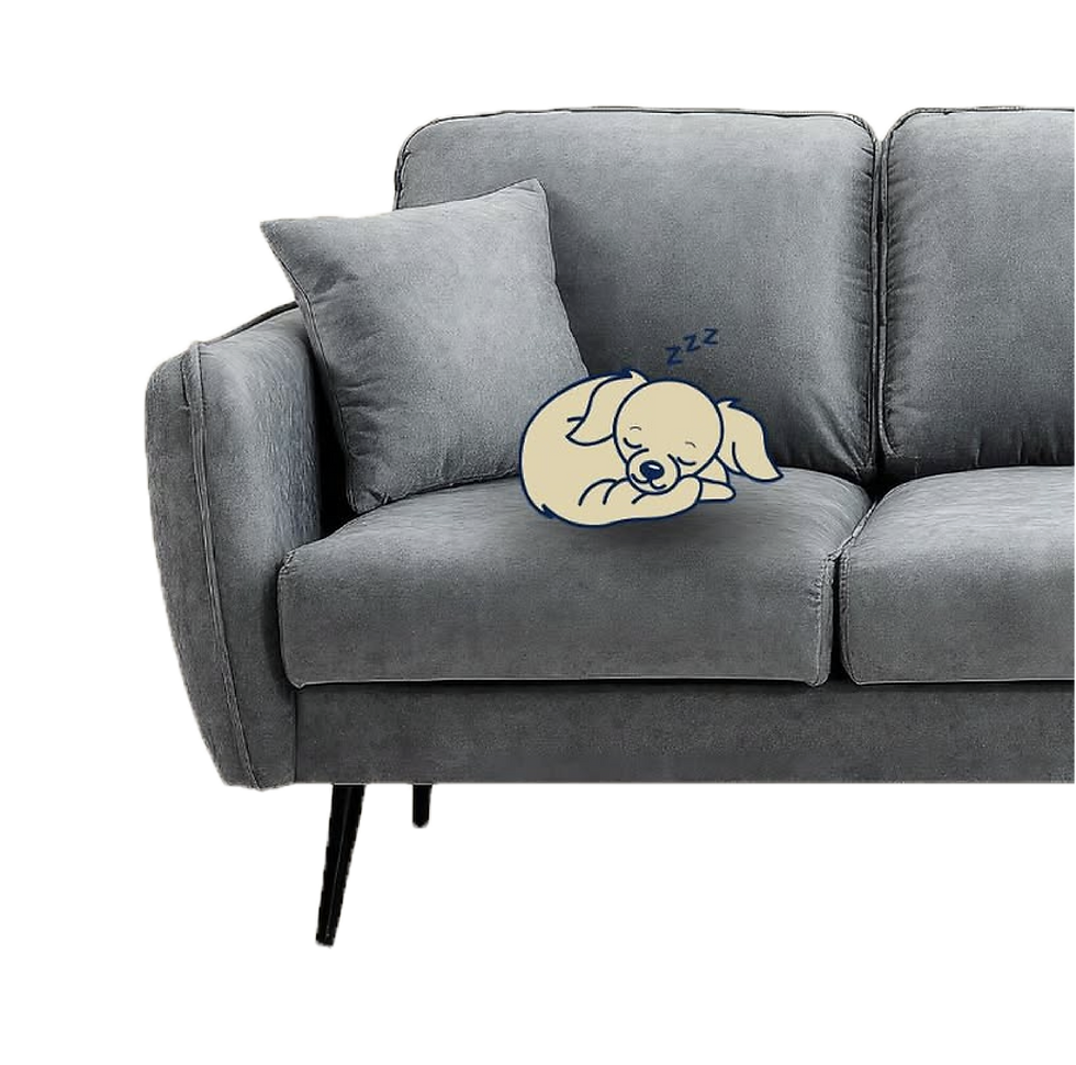
just a mascot.
Bosse became a recognizable guide through Ventimera’s communication system — helping technical information feel warmer, clearer and easier to remember across web, social media and animation.

Bosse is more than just a character

He explains

He guides

He creates recognition
SOCIAL CONTENT SYSTEM
A framework designed for consistency.
Instead of creating isolated posts, the content was structured into recurring themes and formats. Each topic followed a predictable rhythm – combining services, educational content, real-world examples and character-driven storytelling – making the brand easier to recognize while keeping the content varied and engaging.

Sketches I made before I decided which way to go


The result


EXPLAINING AIRFLOW VISUALLY
Invisible systems needed visible storytelling.
Rather than relying on complex technical explanations, the system used visual storytelling to show how modern homes changed — and what happens when airflow disappears.
DESIGNED FOR MOVEMENT
The illustrations were built as a motion system.
The visual language was intentionally designed to evolve into animation later — allowing technical explanations to become even more intuitive through movement and timing.


From the beginning, the illustrations were built as a modular motion system rather than static images. Separating elements into structured layers made it possible to later animate airflow, transitions and environmental changes seamlessly in After Effects.

Warm Air
Animated heat indicators

Fresh Air
Animated airflow indicators
While the illustrations formed the foundation, the animation brought the system to life. In After Effects, airflow, typography and motion cues were added to make complex processes easier to follow.


Curious to see more branding?

